The First Blog Post You Should Read about Gaussian Processes (With Interactive Plots)
Build the core idea of Gaussian process regression step by step, with interactive plots.
Why Read This Post?
Is this the 10th blog post you’ve read about Gaussian Processes and still don’t quite understand them?
When I set out to learn about “Gaussian Processes” (really Gaussian Process Regression), I ended up jumping around between many different resources and it took hours before the core idea hit me. This post should get you to core idea in ~30 minutes using interactive plots.
After that, I’d encourage you to read the references at the end for more detail and rigor. They’ll now be more digestible.
Prerequisites: basic linear algebra and statistics.
If you know python/numpy you might find it helpful to look at the code under the hood: open the live notebook.
Why Gaussian Process Regression?
- It’s a non-linear regression model
- It also does built-in modeling of uncertainties (cool)
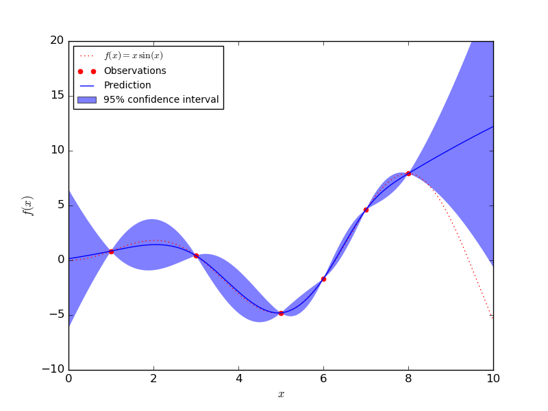
The following plot from the sci-kit learn documentation shows the output of GP regression model. Note the beautifully curved uncertainty bands. Where does all this come from?
GP Regression: The One Line Definition
Turns out GP regression can be described in one (somewhat loaded) line:
GP Regression: A Multivariate Gaussian Distribution over functions, conditioned on some training data.
Hmm. Maybe not so terrible? But how does this connect to the idea of “a nonlinear regression that models uncertainty”?
Let’s unpack this definition bit by bit, starting with “distribution over functions”.
Prequel: Distributions over Functions
We all know linear regression. Given some data, we assume it has the form y = \beta_0 + \beta_1 x + \epsilon. We have some data x and y, and we want to find the \hat{\beta_0} and \hat{\beta_1} (“^” means “estimated”) that describe a line of best fit. We can do this using OLS (ordinary least squares), and we end up with a linear function f(x) = \hat{\beta_0} + \hat{\beta_1} x, that for any x gives us a prediction for y.
Note that we don’t model \epsilon; what if we want some notion of the uncertainty in our predictions?
For example, look at the two plots below:
Even though the data on the left is much more noisy, both linear regressions model the data with the sample simple line. There’s no measure of uncertainty. Let’s try to add some.
What if (just for fun) we assumed \beta_0 and \beta_1 were actually random variables, and that they are normally distributed with variance equal to the variance in the data? Then our linear regression equation would look like this:
y = B_0 + B_1 x
where we’ve converted our betas to random variables as follows:
B_0 \sim N(\beta_0, \sigma^2)
B_1 \sim N(\beta_1, \sigma^2)
This reads “B_0 is a random variable distributed according to a Gaussian with mean \beta_0 and variance \sigma^2”. We’ll set \sigma^2 to be the variance of the data about the best fit line (the variance of the residuals). For the plots a and b above, then we’d have:
y_a = B_{0a} + B_{1a} x
y_b = B_{0b} + B_{1b} x
where B_0 and B_1 are gaussians with variance equal to the variance of the residuals in each case: \sigma^2_a and \sigma^2_b
Now that the betas are random variables, let’s sample from them, and plot the resulting lines:
(Click the “New Sample” button below)
Each time you click the button, a new sample \beta_0, \beta_1 are drawn from the distributions of B_0 and B_1 (one set of betas for the noisy data on the left and one set for the less noisy on the right), and the corresponding lines are plotted.
Notice what we’ve created: it’s a distribution over functions. Each sample from y = B_0 + B_1 x is a different function f(x). Also notice that as you sample more and more, the “spread” or uncertainty of the original fit becomes more and more apparent. You can also see that the uncertainty is higher in the noisier data.
This framework is just to develop for intuition for distributions over functions. For a more rigorous take, check out the bayesian linear regression section here.
Returning to our original definition, we’ve checked off one core idea:
GP Regression: A Multivariate Gaussian Distribution over functions, conditioned on some training data.
What if we want to model a non-linear relationship? Now we’re getting closer to the core idea of GPs. But of course, before we get to Gaussian processes, we have to talk about Gaussians.
Gaussians…and Multivariate Gaussians
The Gaussian, the bell curve, the normal distribution, we’ve seen it before. It’s defined by
Y \sim N(\mu, \sigma^2)
where \mu is the mean and \sigma^2 is the variance. You can play around with the parameters of the distribution below. Each time you change the sliders, 10,000 samples are drawn from the distribution and plotted as a histogram.
What about multivariate Gaussians? That is, a Gaussian distribution but with more than one variable. They are basically the same thing, but instead of having a single mean and variance, there’s there’s a mean vector and a covariance matrix.
So while a single Gaussian is this:
Y \sim N(\mu, \sigma^2)
Where \mu is the mean and \sigma is the variance, a multivariate Gaussian is this:
\textbf{Y} \sim N(\boldsymbol{\mu}, \Sigma)
Where \boldsymbol{\mu} is a vector of means, \Sigma is a covariance matrix.
\boldsymbol{\mu} = \begin{bmatrix} \mu_1 \\ \mu_2 \\ \vdots \\ \mu_n \end{bmatrix},
\qquad \Sigma = \begin{bmatrix} \sigma_{11} & \sigma_{12} & \dots & \sigma_{1n} \\ \sigma_{21} & \sigma_{22} & \dots & \sigma_{2n} \\ \vdots & \vdots & \ddots & \vdots \\ \sigma_{n1} & \sigma_{n2} & \dots & \sigma_{nn} \end{bmatrix}.
In the above expressions, \mu_i is the mean of the i th component of \textbf{Y}
In this case when we sample from \textbf{Y}, we get a vector \textbf{Y} = [Y_1, Y_2, \dots, Y_n]^T, instead of just a single value.
Nothing too crazy right? Well, except that the multivariate normal distribution has a covariance matrix, not just a variance.
In the covariance matrix we specify not only the variance of each variable, but also the covariance between each variable and every other. Each of the n variables in a multivariate Gaussian can be correlated with each other. Below is an overhead view of a bunch of samples for a 2D multivariate Gaussian distribution. You can interactively change the covariance matrix to see how it affects the distribution.
Note that if you change the diagonal elements, the variance of one or the other variable will change (look at the scale of axes). If you change the off-diagonal elements, the covariance between the two variables will change.
You also probably saw that the matrix has to be symmetric and with positive diagonals. Why? Well think about what covariance is: its how two variables vary together. It doesn’t make sense for Cov(X,Y) != Cov(Y,X). And it doesn’t make sense for Cov(X,X) — that is, Var(X) — to be negative (you’ll get an error if you try).
Also note that while the combined joint distribution changes form, each of the individual distributions is still a Gaussian. That is to say, the distribution of X_1 is still a gaussian, and the distribution of X_2 is still a Gaussian. The only thing that changes is the covariance between the two variables.
Gaussian Distribution Over Functions
So far we’ve visualized a multivariate Gaussian of just two variables, but you can imagine taking this into many many dimensions. That is to say, many many Gaussian random variables that may or may not be correlated with each other according to some big covariance matrix.
In order to think about more than two dimensions, we’ll need to visualize our distributions differently. Let’s start with a 1-D Gaussian. We’ll draw samples from the distribution and plot them below:
Each new sample is drawn from a normal distribution with mean 0 and variance 1.
What if we want to sample from a multivariate normal distribution? Well, this time \textbf{Y} is a vector of random variables. If \textbf{Y} is 2-d then \textbf{Y} = [Y_1, Y_2]^T, so each sample is a vector of two values which we’ll plot each on their own part of the X-axis.
So now each time we sample from a bivariate normal distribution, we get a vector of two numbers, which we plot as two connected points. Now let’s look at a 3-D Gaussian, \textbf{Y}_{3D} = [Y_1, Y_2, Y_3]^T,
Now let’s take it to an extreme: a 50-D Gaussian. \textbf{Y}_{50D} = [Y_1, Y_2, Y_3, \dots, Y_{50}]^T, so every sample is a vector of 50 random values.
Cool, so now we can visualize samples from a 50-D Gaussian in this kinda of weird way. How is this useful? And how does this relate to a Gaussian Process regression?
You’ll notice the above plot has a “Connect” button. If you click it, each variable in a given sample gets connected to the next.
Do these connected samples remind you of anything? Maybe a certain class of elementary mathematical objects?
If you thought “functions” then you are getting what I’m going for here. Each sample from the 50-D Gaussian is starting to look like some curve where, for any x-coordinate (which is just the index of the vector output of the multivariate gaussian) you can look up a y-value. So this kinda-sorta function can be defined as
f(x) = Y_{x}
given a multivariate Gaussian Y = [Y_1, Y_2, Y_3, \dots, Y_{x}]^T \sim N(\boldsymbol{\mu}, \Sigma).
But remember what each different colored curve is: it’s a sample from a multivariate normal distribution. It’s almost like the 50-D Gaussian specifies a distribution over functions…

Almost. The 50-D Gaussian really only specifies a distribution over 50 discrete values, so it’s not quite a distribution over functions f(x) that can take any value of x. Hold that thought for now, we’ll return to this later.
But first you might have some questions. Remember, the above plot was made by taking a few samples from 50-D gaussian, \textbf{Y}_{50D} \sim N(\boldsymbol{\mu}, \Sigma)
But I didn’t tell you what \boldsymbol{\mu} and \Sigma were. Well, I actually used a mean vector of all zeros:
\boldsymbol{\mu} = \begin{bmatrix} 0 \\ 0 \\ \vdots \\ 0 \end{bmatrix},
and for the covariance matrix I simply used the Identity matrix.
\Sigma = \begin{bmatrix} 1 & 0 & \dots & 0 \\ 0 & 1 & \dots & 0 \\ \vdots & \vdots & \ddots & \vdots \\ 0 & 0 & \dots & 1 \end{bmatrix}.
Since this covariance matrix is really big, let’s visualize it with a heatmap:
This means that each of the variables in our multivariate normal distribution are…..????
No variable has any covariance with any other, so you can think of this multivariate Gaussian as simply 50 separate Gaussians, each with mean = 0 and variance 1. This is why the curves we plotted above are so all over the place: each point is randomly bouncing up and down with no influence from its neighbors.
What if we add some non-zero values to the covariance matrix that are off-diagonal?
Remember the diagonal elements of the matrix at row and column i is Cov(Y_i, Y_i) = Var(Y_i) while the off-diagonal elements at i,j are Cov(Y_i, Y_j).
For example, check out the covariance matrix below:
It looks very similar, but it’s “fuzzier” around the diagonal. Think about what type of values you would expect from a Gaussian with this covariance matrix.
(Try playing around with the mysterious “ℓ” slider, will explain later).
It’s saying that variables near each other are more correlated than variables far away. For example variable 1 is more correlated with variable 2 than it is with variable 50. Let visualize some samples from a 50-d Gaussian with this new covariance matrix. But before you hit the “sample” button, what do you think these new curves will look like?
Cool, they are now much smoother. This is because the variables near each other are more correlated, so nearby points are more likely to be similar. This smooths out the curves.
Now we can see that by changing the covariance matrix, we can control the shape of the functions that our multivariate normal distribution produces.
Making these “functions” into Functions
We’ve been throwing around the word “functions” a lot now, but we still never resolved the problem that these samples are really just 50-D vectors. Sure we can connect the points with little lines, but that’s not the same as a function. How do we get a distribution over true functions?
The answer lies in how we define the covariance and mean of our multivariate Gaussian. So far we’ve been manually inputting some mean vector and covariance matrix. Since these are objects with discrete, finite elements, we can’t really think of the distributions they define as functions. But what if we could redefine these objects (the mean and covariance) as functions?
Mathematically:
\boldsymbol{\mu} = m(\textbf{x}) \\ \Sigma = k(\textbf{x, x})
Now for whatever x we are interested in, we can sample from a multivariate Gaussian with mean m(\textbf{x}) and covariance k(\textbf{x, x}). This is one of those mathematical tricks that’s so simple it’s hard to understand, or maybe feels like cheating, so let’s go through an example.
Say we want to sample from a few specific real number \textbf{x} = [-\pi, \pi, 2\pi]^T (some multiples of pi, as in 3.141…). First let’s define a mean function m(\textbf{x}). We can use anything we like, so let’s so something really simple: m(\textbf{x}) = \textbf{x}.
For the covariance function k(\textbf{x, x}), we need a function of x that generates a symmetric matrix with a positive diagonal (otherwise it would not be a valid covariance). Again let’s just do something really simple: k(\textbf{x}, \textbf{x}) = \operatorname{diag}(\textbf{x} \odot \textbf{x} ), where we take \odot to mean the element-wise product of \textbf{x} with \textbf{x}.
You maybe be wondering, “why define the covariance function as k(\textbf{x, x}) instead of simply k(\textbf{x})?”. The reason is that covariance functions in general calculate a covariance between two vectors that are not necessarily the same. Here we are just calculating the covariance of \textbf{x} with itself, but this will not always be the case…
So if we put out test vector into these functions we get:
\boldsymbol{\mu} = m(\textbf{x}) = \textbf{x} = [-\pi, \pi, 2\pi]^T\\
\Sigma = k(\textbf{x}, \textbf{x}) = \operatorname{diag}(\textbf{x}\odot\textbf{x}) = \begin{bmatrix} (-\pi)^2 & 0 & 0 \\ 0 & (\pi)^2 & 0 \\ 0 & 0 & (2\pi)^2 \end{bmatrix}
Now we can sample from a multivariate Gaussian at these specific values of x:
But now that we’ve defined our mean and covariance functions, we can sample from a multivariate Gaussian at any value of x we want. For example, let’s sample at 50 evenly spaced real values of x between -1 and 1. All we do is plug these values into our mean and covariance functions, and then sample from the resulting multivariate Gaussian.
Now we’ve truly got a distribution over functions.
If we want the distribution at any value x, we can just plug it in to the mean and covariance functions and voila! We just need to define a mean and valid covariance function that we like, and we can sample from a multivariate Gaussian at any value of x we want.
By the way, “covariance functions” are usually referred to by a fancy name: kernel functions. Remember this plot of a covariance matrix from earlier?
This covariance we actually generated by using a specific kernel function called the squared exponential kernel, a.k.a. the Gaussian kernel a.k.a the radial basis function (RBF) kernel. I’ll refer to it as the RBF kernel for this post.
It’s defined as:
k(\textbf{x}) = \exp\left(-\frac{1}{2ℓ^2} ||\textbf{x} - \textbf{x}||^2\right)
where ||\textbf{x} - \textbf{x}||^2 is the element-wise squared difference matrix between each element of x with each other element, and ℓ is an adjustable parameter.
No need to worry about the math here too closely. The important thing to note is that the RBF kernel is a function of \textbf{x} that generates a positive semidefinite matrix. It’s a covariance function, a.k.a. kernel, and it happens to be one of the most useful kernels in the real-world.
# The RBF kernel, implemented in python with numpy
def pairwise_rbf(xa, xb, l=5.0):
    sq_norm = (-0.5 / l**2) * sp.spatial.distance.cdist(xa, xb, "sqeuclidean")
    return np.exp(sq_norm)
Using this kernel function, lets sample from a multivariate Gaussian at 50 evenly spaced real values of x between -1 and 1. But this time you can adjust the slider to change the value of the kernel’s l parameter and see how it changes the shape of the covariance matrix and the resulting distribution over functions.
Conditioning on Data
Wow, we’ve come a long way. Let’s regroup here and remember our original definition of a Gaussian Process Regression.
GP Regression: A Multivariate Gaussian Distribution over functions, conditioned on some training data.
In fact this highlighted part above is the definition of a Gaussian Process. But we want “Gaussian Process Regression”. (People sometimes use the two to mean the same thing, but technically GP is the distribution and GPR is the regression problem.)
We’re more than half-way done! But we still need to condition it on some training data. Right now we’re just sampling these pretty functions, but they are completely random.
Conditioning means we want the probability of some outcome given some data. Mathematically we write this as:
p(y | x)
that is, the probability of some outcome y given some other data x.
Let’s take a simple toy problem as a concrete example:
Say we are trying to predict the cost of a house along a particular road. At one end of the road, there is a nuclear power plant (yikes). We have some data on the cost of some of the houses on this road, but we want to predict the cost of a house at any location. Let’s look at the data first:
Right away we see a couple things. Housing costs are not just linearly increasing as we get further away from the plant; there seem to be a few dips. Maybe there is a prison 5 miles away from the plant; who knows. Regardless, we probably want some non-linear model for this data.
The main question at hand is given this known cost data, what is the expected cost of a house at another location x?
To state this mathematically, we want some function structured as follows:
p(\textbf{c} | \textbf{x})
That is, we want the probability distribution of cost of a house c, given its distance x from the nuclear plant. Since we’ve been thinking about multivariate Gaussian, let’s make an assumption that the distribution above follows a multivariate Gaussian.
p(\textbf{c} | \textbf{x}) \sim N(m(\textbf{x}), k(\textbf{x}, \textbf{x}))
Where k(\textbf{x}, \textbf{x}) is the covariance function, and m(\textbf{x}) is the mean function. For now we’ll just assume that the mean function is zero, and for the covariance function we’ll use the RBF kernel.
Why these? Remember the RBF function’s effect above: it sort of “smooths” out the data. This makes sense to model housing prices, because it’s reasonable to expect that houses near each other will have similar prices.
But why is the mean function zero? A: trust me bro. It just works out in practice that mean = 0 is usually good enough to model the data. For example sklearn’s GP implementation doesn’t even let you specify a mean function. For more on this see Section 2.7 here.
We really need the following if we want to condition on the known data:
p(\textbf{c} | \textbf{x}, \textbf{c}_{\text{known}}, \textbf{x}_{\text{known}})
Putting this into words, we want the probability distribution of prices of a house, given its location and given the prices of houses at some other locations.
Let’s assume that the known data also came from the same multivariate Gaussian distribution as the unknown. So we can write:
p(\textbf{c}_{\text{known}}| \textbf{x}_{\text{known}}) \sim N(0, k(\textbf{x}_{\text{known}}, \textbf{x}_{\text{known}}))
And for the unknown data, remember we had:
p(\textbf{c} | \textbf{x}) \sim N(0, k(\textbf{x}, \textbf{x}))
Notice that we’ve assumed both the known data and the unknown data come from multivariate Gaussians. What if we just combined them into one big multivariate gaussian? We could basically just stack the distributions on top of each other to form a big “mother” Gaussian.
p(\begin{bmatrix} \textbf{c} \\ \textbf{c}_{\text{known}} \end{bmatrix} | \begin{bmatrix} \textbf{x} \\ \textbf{x}_{\text{known}} \end{bmatrix}) \sim N\left(\begin{bmatrix}0 \\ 0\end{bmatrix}, \begin{bmatrix}k(\textbf{x}, \textbf{x}) & k(\textbf{x}, \textbf{x}_{\text{known}}) \\ k(\textbf{x}_{\text{known}}, \textbf{x}) & k(\textbf{x}_{\text{known} }, \textbf{x}_{\text{known}})\end{bmatrix}\right)
The one wrinkle here is the covariance function. For the off-diagonal elements, we need to use the covariance function between the unknown data and the known data. So now we see why the kernel function is written as k(\textbf{x}, \textbf{x}); in this case we need to compute the covariance between two different vectors of data to fill in the off-diagonal blocks of the covariance matrix above.
Can we massage the beast above into a probability distribution conditioned on the known data? Like so:
p(\textbf{c} | \textbf{x}, \textbf{c}_{\text{known}}, \textbf{x}_{\text{known}}) \sim ???
The answer is yes. It’s the following:
p(\textbf{c} | \textbf{x}, \textbf{c}_{\text{known}}, \textbf{x}_{\text{known}}) \sim N\left(m(\textbf{x}) + k(\textbf{x}, \textbf{x}_{\text{known}})k(\textbf{x}_{\text{known}})^{-1}(\textbf{c}_{\text{known}} - m(\textbf{x}_{\text{known}})), k(\textbf{x}) - k(\textbf{x}, \textbf{x}_{\text{known}})k(\textbf{x}_{\text{known}})^{-1}k(\textbf{x}_{\text{known}}, \textbf{x})\right)
Please don’t get mad at me for just giving you the answer. It’s a kind of complicated derivation, and I don’t want us to get bogged down. If you want to go through it, see this section of Gaussian Processes for Machine Learning.
For now, just accept that there’s a nice closed form solution to this problem.
Wait, uh, so we’re done?
GP Regression: A Multivariate Gaussian Distribution over functions, conditioned on some training data.
We’re done! We’ve got a nice closed form distribution over functions conditioned on some data.
Actually Fitting a Regression Model
Using our conditional distribution above, we can plug in our known house costs to create a conditional distribution of functions. Then we can sample from this distribution at, say, 50 evenly spaced distance from 0 to 12 miles away from the nuclear plant.
We have 15 known cost data points. This means that \textbf{c}_{\text{known}} and \textbf{x}_{\text{known}} is are vectors of length 15. We want to predicted prices at 50 evenly spaced points, so \textbf{x} and \textbf{c} are vectors of length 50.
Plugging this into the conditional distribution above, we can now sample from the conditional distribution of functions:
Note: we’re using the RBF kernel here with parameter ℓ set to 1.0.
Yeah baby. Now this looks like a Gaussian process regression. Clearly the samples from the distribution are conditioned on known data, because all the functions we sample pass through the known data points. But in between the known data points the functions are free to somewhat randomly vary, giving us an idea of the uncertainty. How smoothly the functions vary is determined by the covariance function, which in this case is the RBF kernel.
In the plot below, I reveal the true underlying function I used to generate this “housing data” (pink). What if we take 500 samples from this posterior distribution?
Remember what there blue lines are: they are samples from a multivariate gaussian conditioned on the known data points, and sampled at 500 evenly spaced points between 0 and 12. We used the complicated formula above to find the conditional mean vector and conditional covariance matrix, and then sampled from a distribution using that mean and covariance.
Below are some heatmaps of the conditional covariance matrix and conditional mean vector (conditioned on the known housing data) that specify the predictive multivariate gaussian distribution.
Think for a moment about why this conditional mean and covariance makes sense.
Outro
You should now have the core ideas of Gaussian processes regression. If you still have some questions, like:
- “Do you really have to sample 100s of functions to get the confidence intervals?”
- (You should now be able to figure out the answer to this.)
- “How do we choose a kernel function?”
- “How do we choose the best parameters for the kernel function?”
- “What if the training data is intrinsically noisy (the price of houses has some variance at a given location)”
- “What if there are many features in my training data? E.g. Square footage of houses.”
- “But I heard GPs are expensive to train?”
…then you should check out the resources below, which should be easier to understand now that you have the basics.
References
Tutorials and Guides
Gaussian Process Tutorial - Really awesome set of blog posts that teaches GPs using Python. I basically took this post and made it more verbose. The other posts in the series go into more detail about the process of fitting a GP and optimizing the kernel and hyperparameters.
Visual Exploration of Gaussian Processes - More detailed, with beautiful interactive visualizations. Explores other non-RBF kernel functions more.
Fitting Gaussian Process Models in Python - Practical guide focused on implementing GPs using scikit-learn and other Python libraries.
Advanced Reading
- Gaussian Processes for Machine Learning - The book on GPs, with all the detail you’ll ever need.